Poland Spring Sparkling
Bottling the spirit
Rebuild Poland Spring Sparkling to feel unmistakably part of the family again, rooted in the Northeast region it calls home.
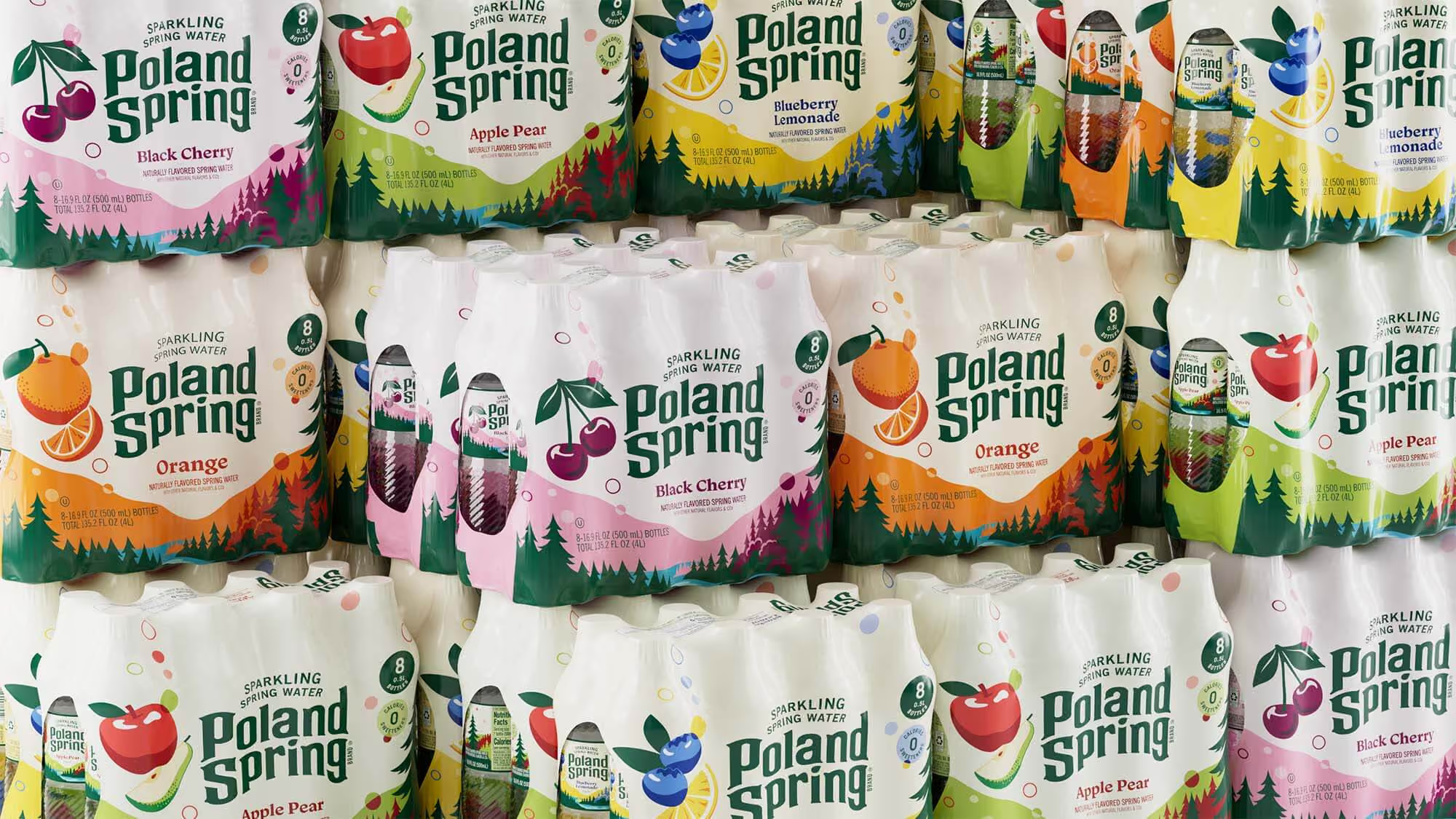
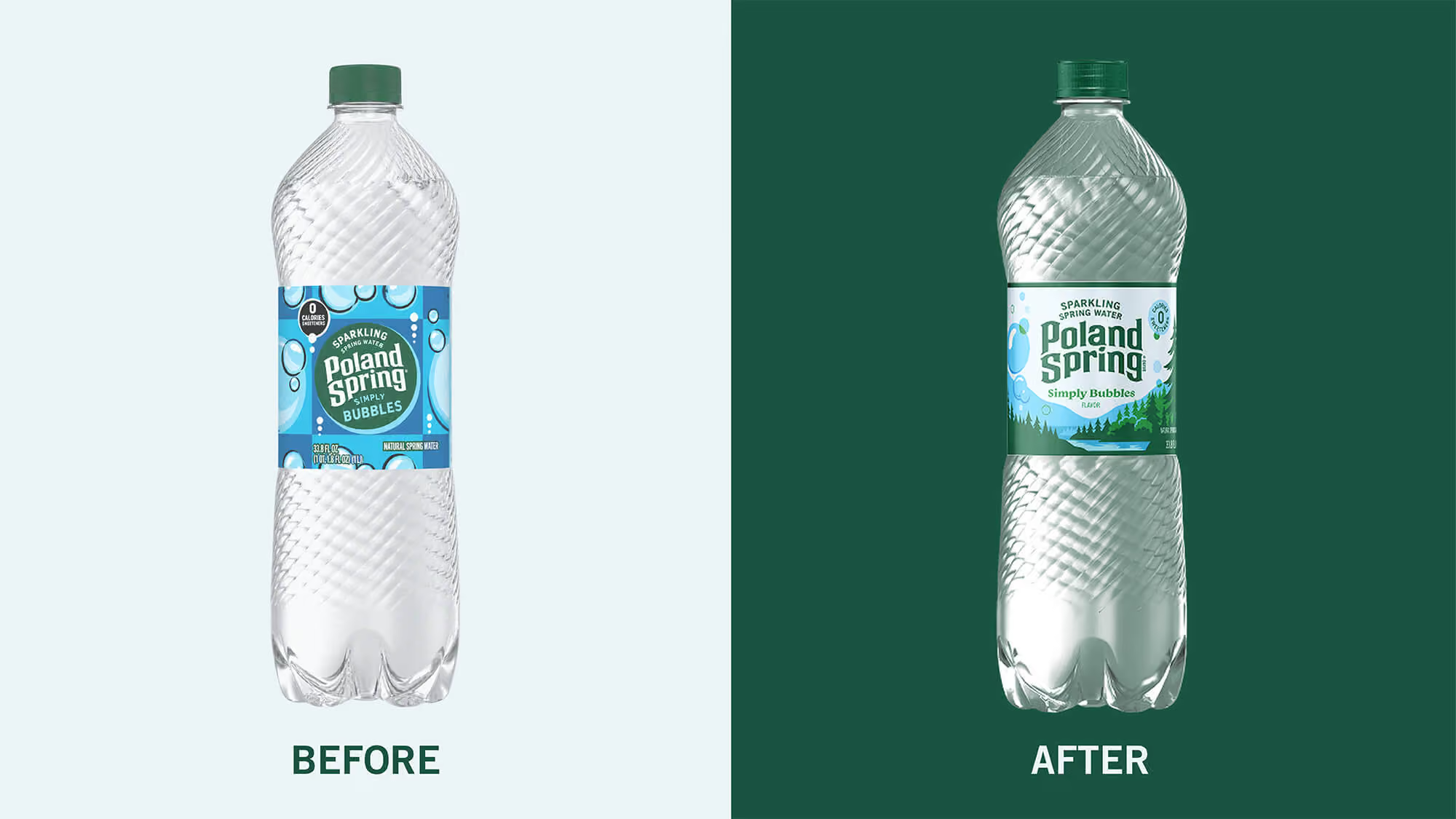
The fruit-forward packaging was burying the thing that actually made the product different: this is real sparkling spring water. Flavor cues had overtaken the brand, contributing to a 13% decline in dollar sales. Rather than chase category conventions, we returned to the equity Poland Spring already owned: its iconic green, which dominates the core label, and its heritage logo dating back to 1845, depicting the spring, pines, and rolling Northeast landscape.
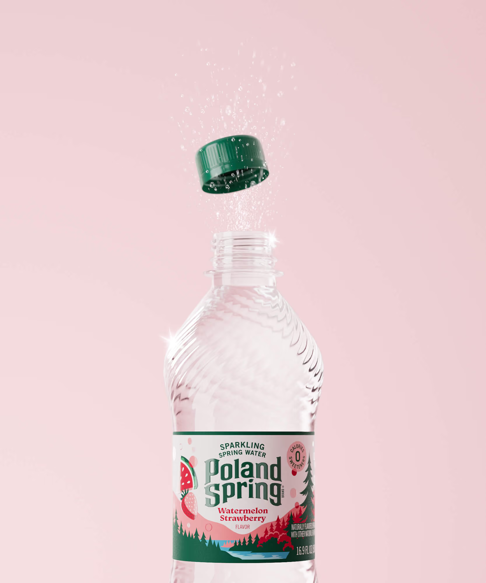
We brought it all to life through an Effervescent Spirit — the restless, proud energy of the Northeast and the people who call it home. An illustrated landscape now wraps every pack, with pines and a winding spring rendered with the charm of a vintage travel poster. Flavor appears through changing skies, while the landscape stays grounded in unmistakable Poland Spring green. The full logo once again anchors the pack, unifying nine flavors into one distinctive family that stands apart from AHA, Polar, LaCroix, bubly, and Perrier. It feels like Poland Spring again: natural, rooted, recognizable, and built to travel across the broader Primo portfolio.
Design Strategy
Visual Identity
Packaging Design



SEE MORE PROJECTS
From online obsession to retail expansion
The first supplement you actually want to take
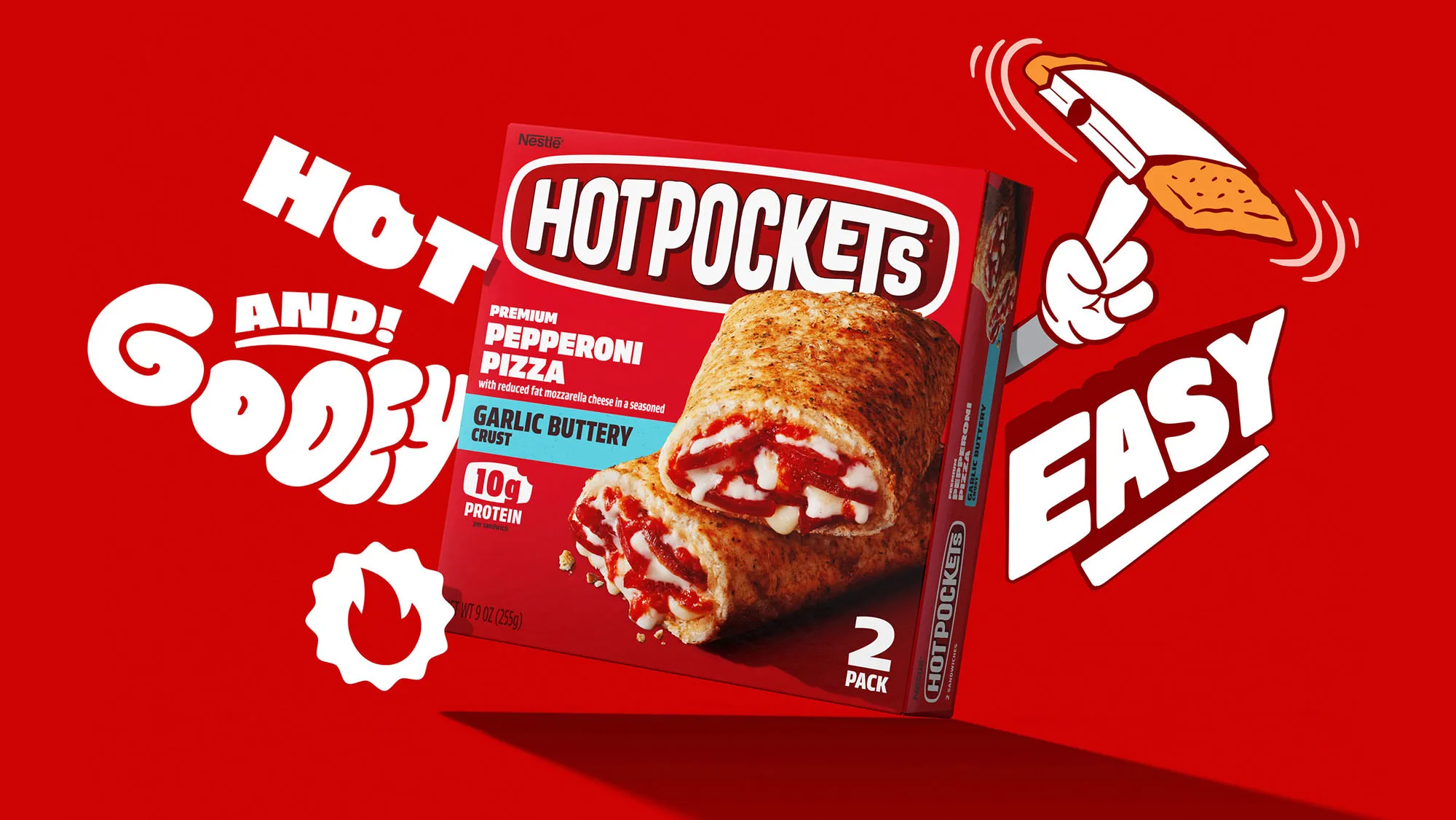
Putting the "hot" back in Nestlé Hot Pockets

A rebrand worthy of an Icon
Bottling the Spirit
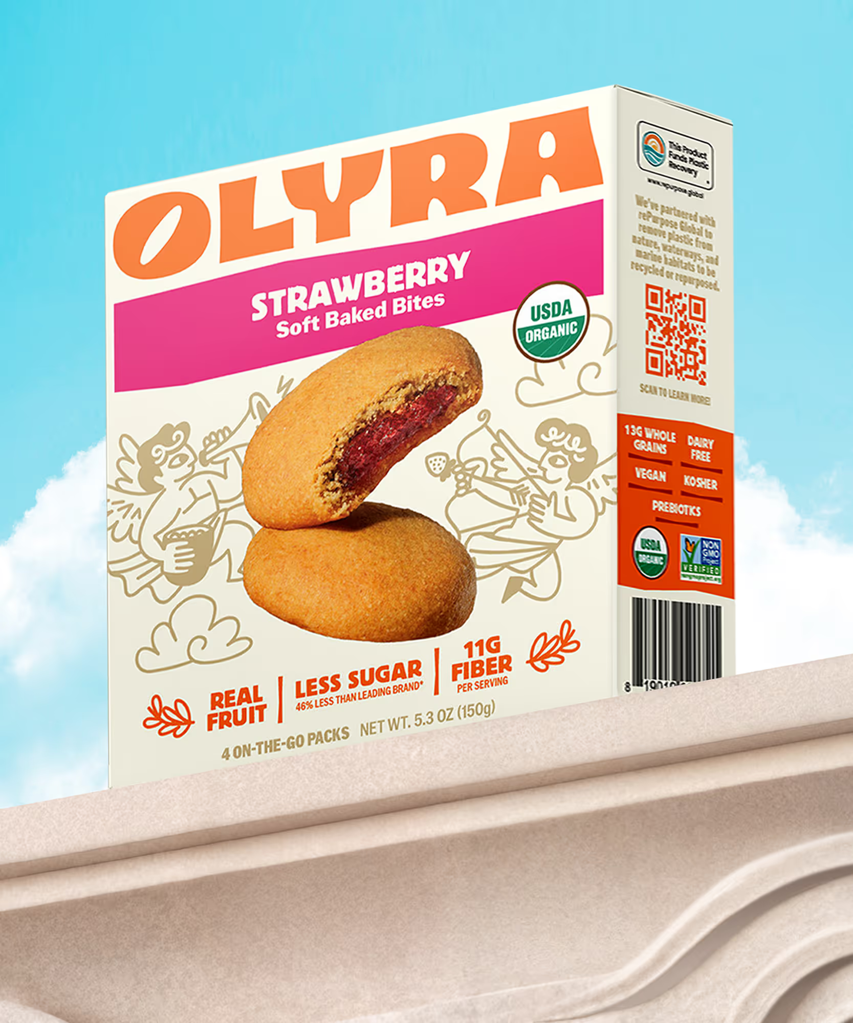
Rebranding from the grain up
Consider it covered
Keeping it HUNDY!

Making waves in wellness
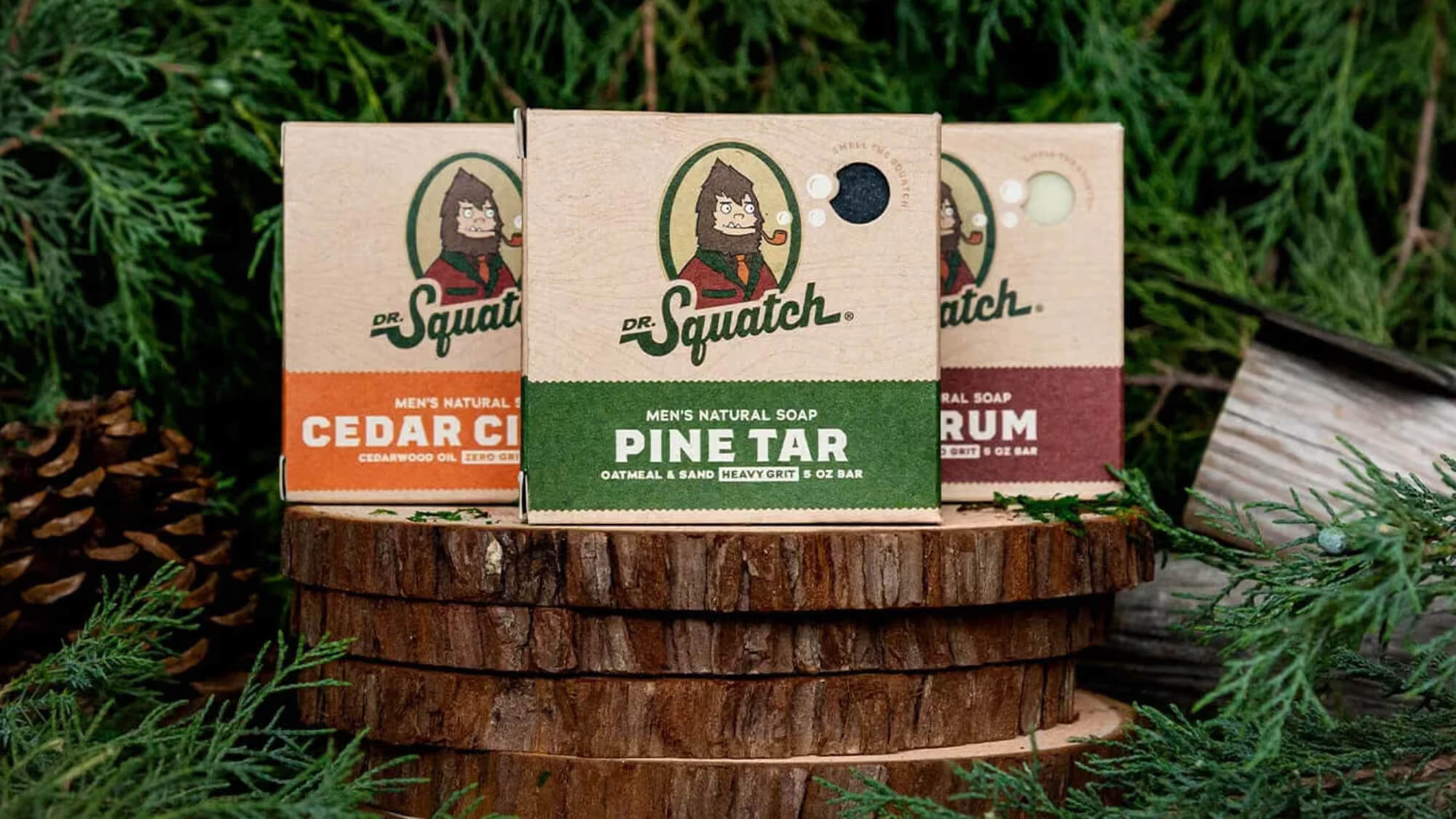
A bigfoot forward in design for men's personal care

Distilling the spirit of the desert

Satisfaction without sacrifice
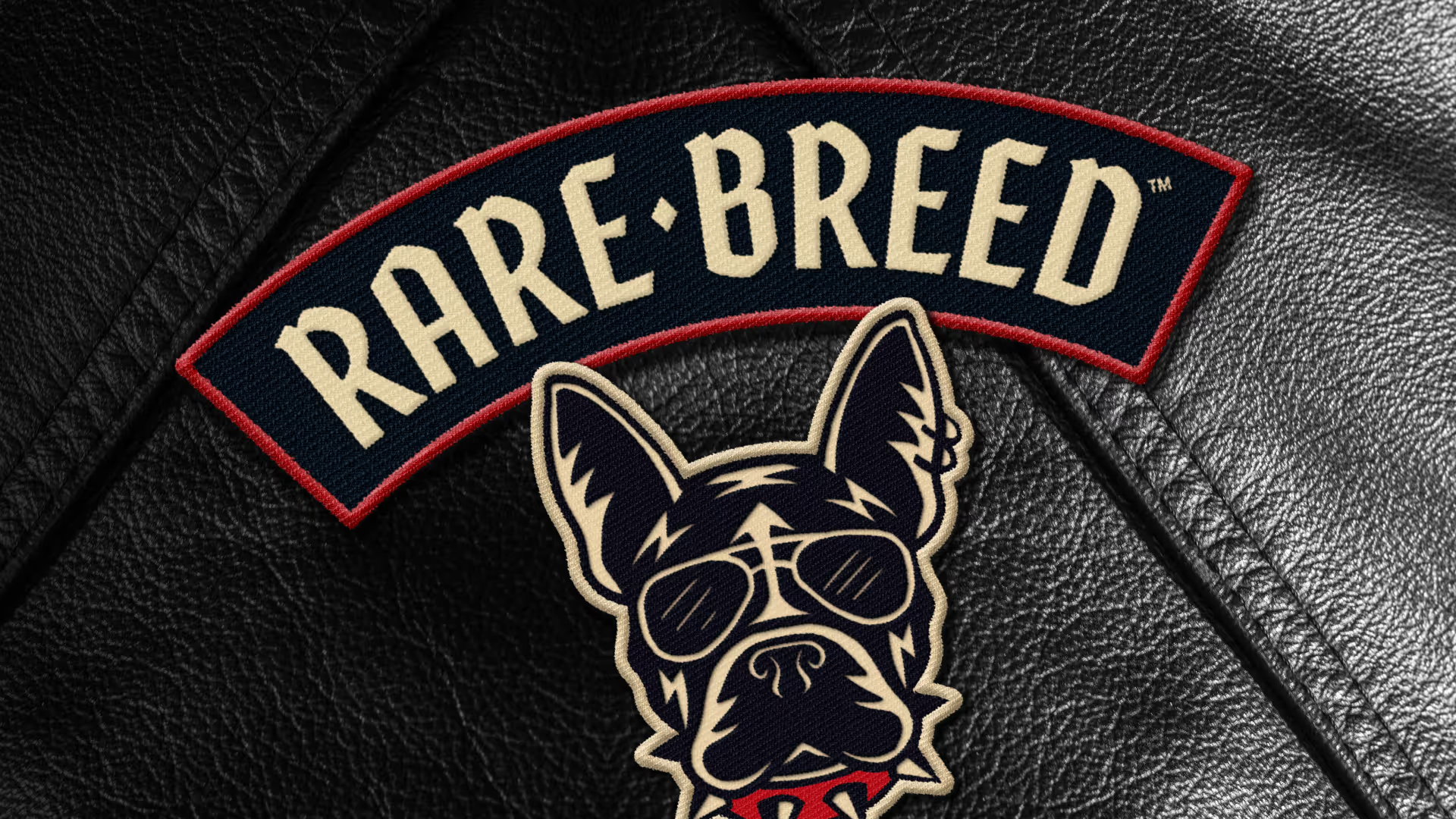
Creating a new leader of the pack
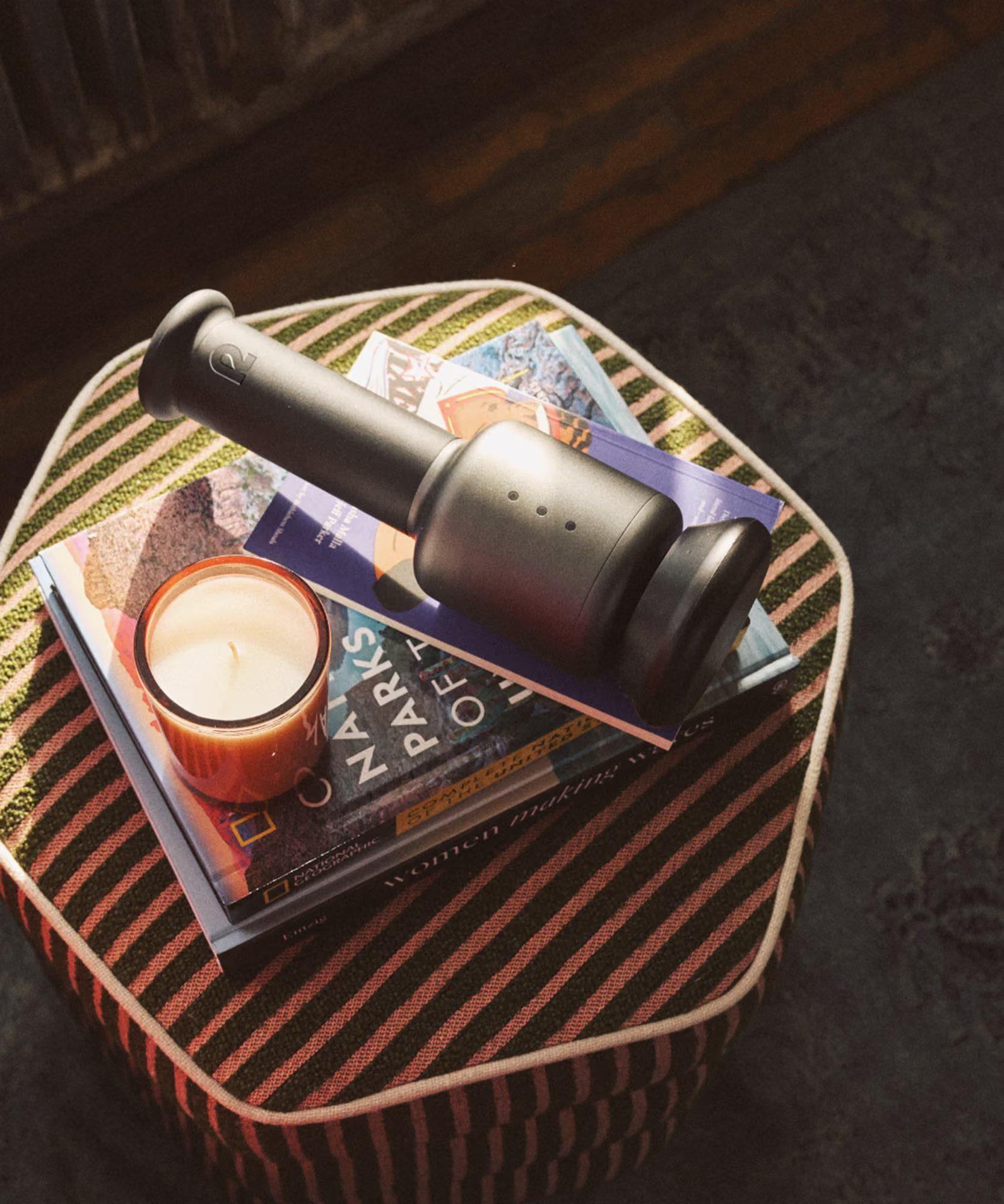
Creating a revolution in recovery
Cracking the code on healthy eating

Building on a viral sensation

Crafting the new generation of non-alc cocktails
Branding better-for-you cider

Faith meets flavor
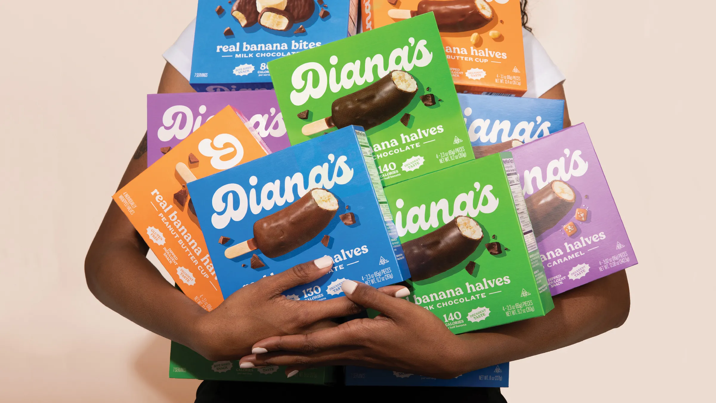
Going bananas with a classic frozen treat
