Grüns
The first supplement you actually want to take.
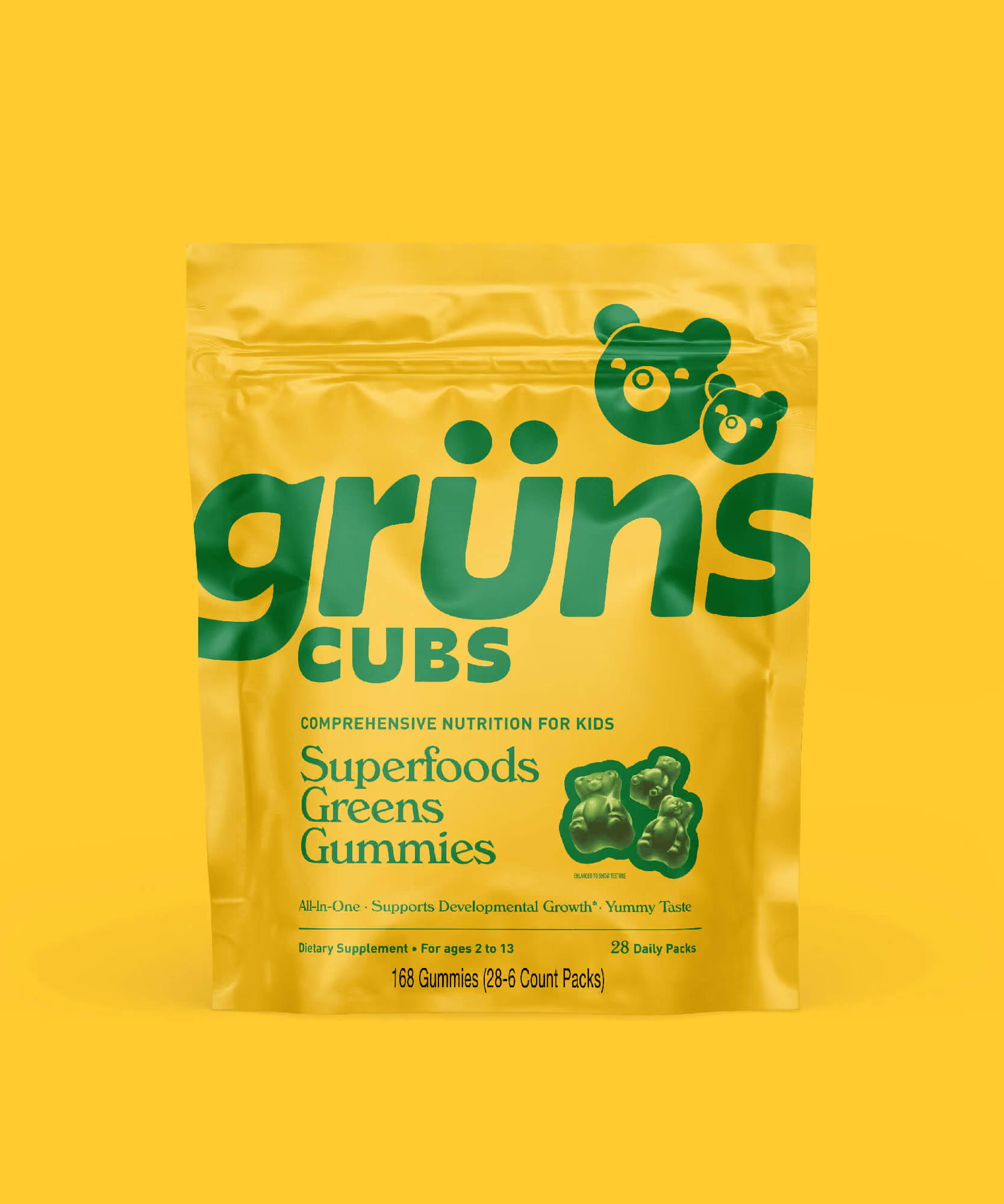
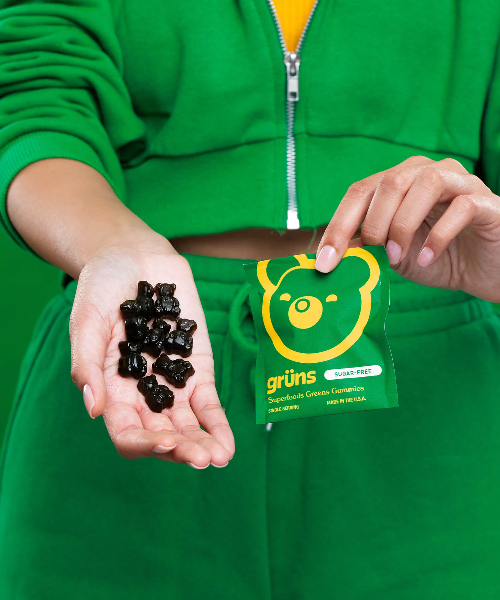
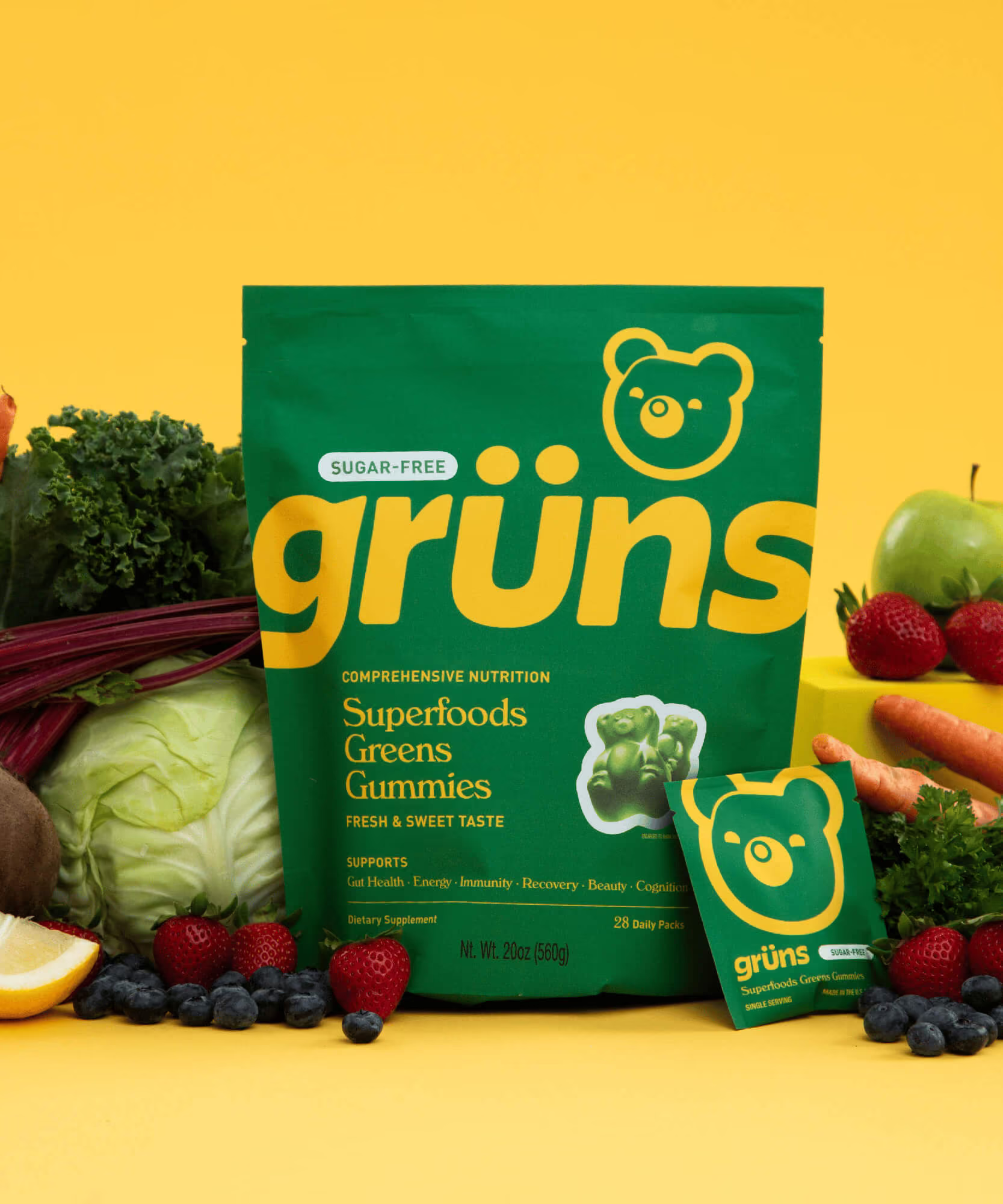
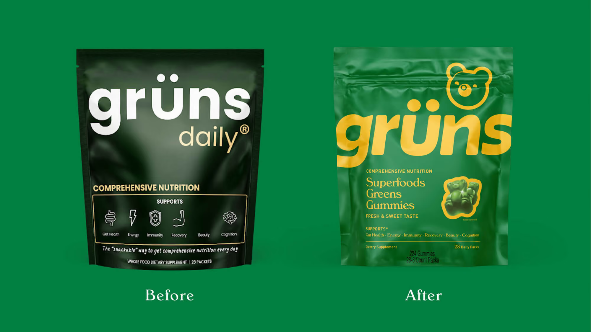
Grüns disrupted the supplements category by transforming 60 whole-food ingredients into tasty, snackable nutrition, building strong DTC momentum through a playful and approachable brand personality. As the company expanded into retail and omnichannel distribution, the packaging needed to work harder on shelf while balancing fun, taste appeal, and scientific credibility.
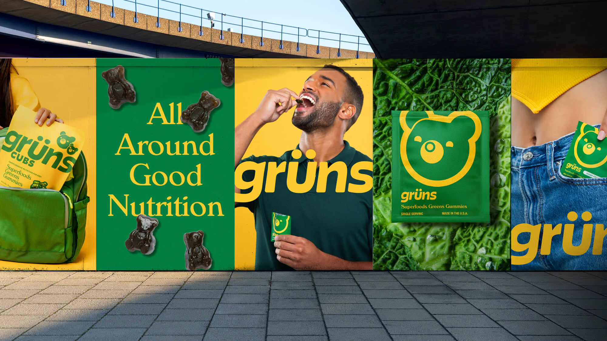
Our insight was that Grüns’ greatest differentiator was its ability to make wellness feel enjoyable rather than clinical. Instead of following traditional supplement conventions, we amplified the brand’s gummy-inspired personality through a modernized bear mascot, custom typography, vibrant color systems, and a stronger information hierarchy designed to improve shelf recognition and communicate nutritional benefits more clearly.
We also developed a scalable portfolio architecture that differentiated adult and kids’ products while maintaining cohesion across the growing line. The result was a retail-ready identity that strengthened shelf standout, increased consumer engagement, and supported rapid omnichannel growth. Early sales velocities at Sprouts exceeded expectations, and in April 2026, Unilever announced its acquisition of Grüns.
Design Strategy
Visual Identity
Typography
Packaging
SEE MORE PROJECTS
From online obsession to retail expansion
The first supplement you actually want to take
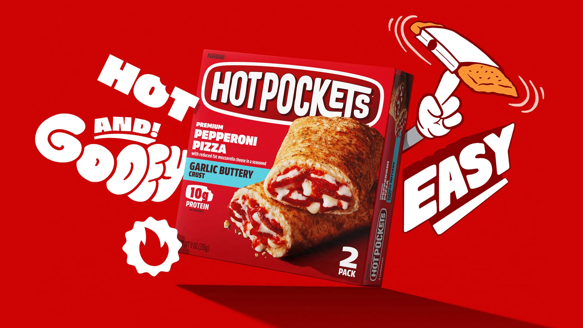
Putting the "hot" back in Nestlé Hot Pockets

A rebrand worthy of an Icon
Bottling the Spirit
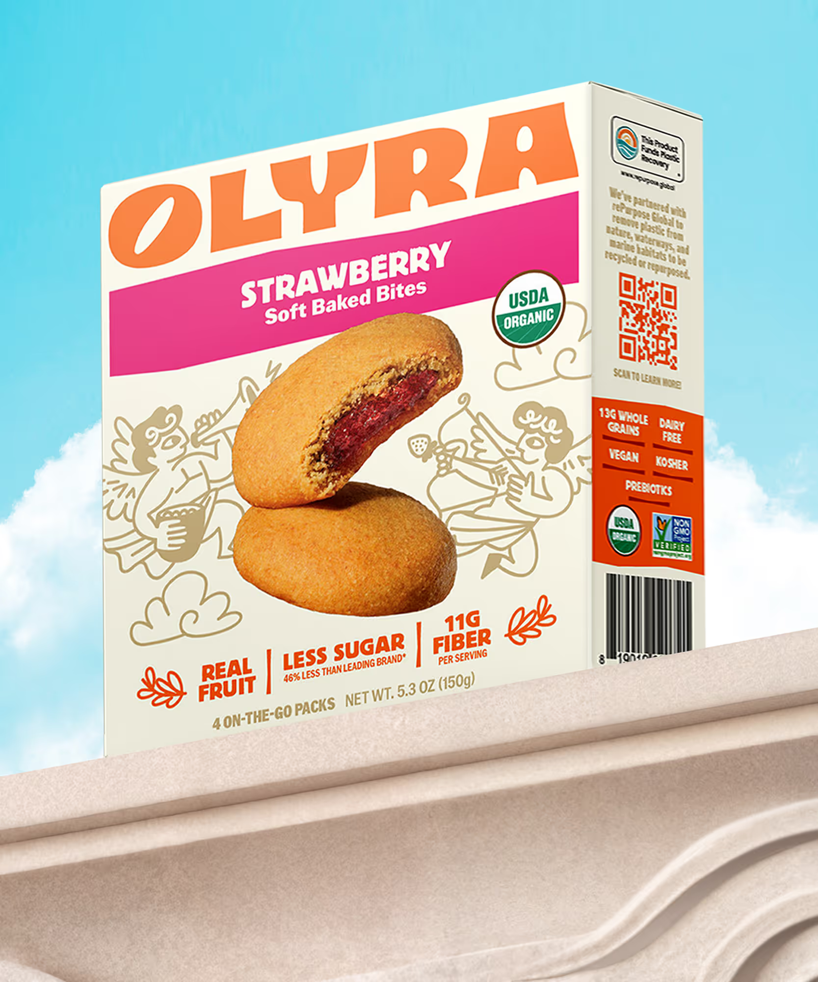
Rebranding from the grain up
Consider it covered
Keeping it HUNDY!

Making waves in wellness
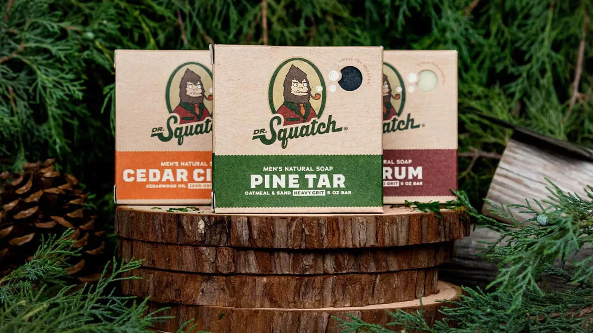
A bigfoot forward in design for men's personal care

Distilling the spirit of the desert

Satisfaction without sacrifice
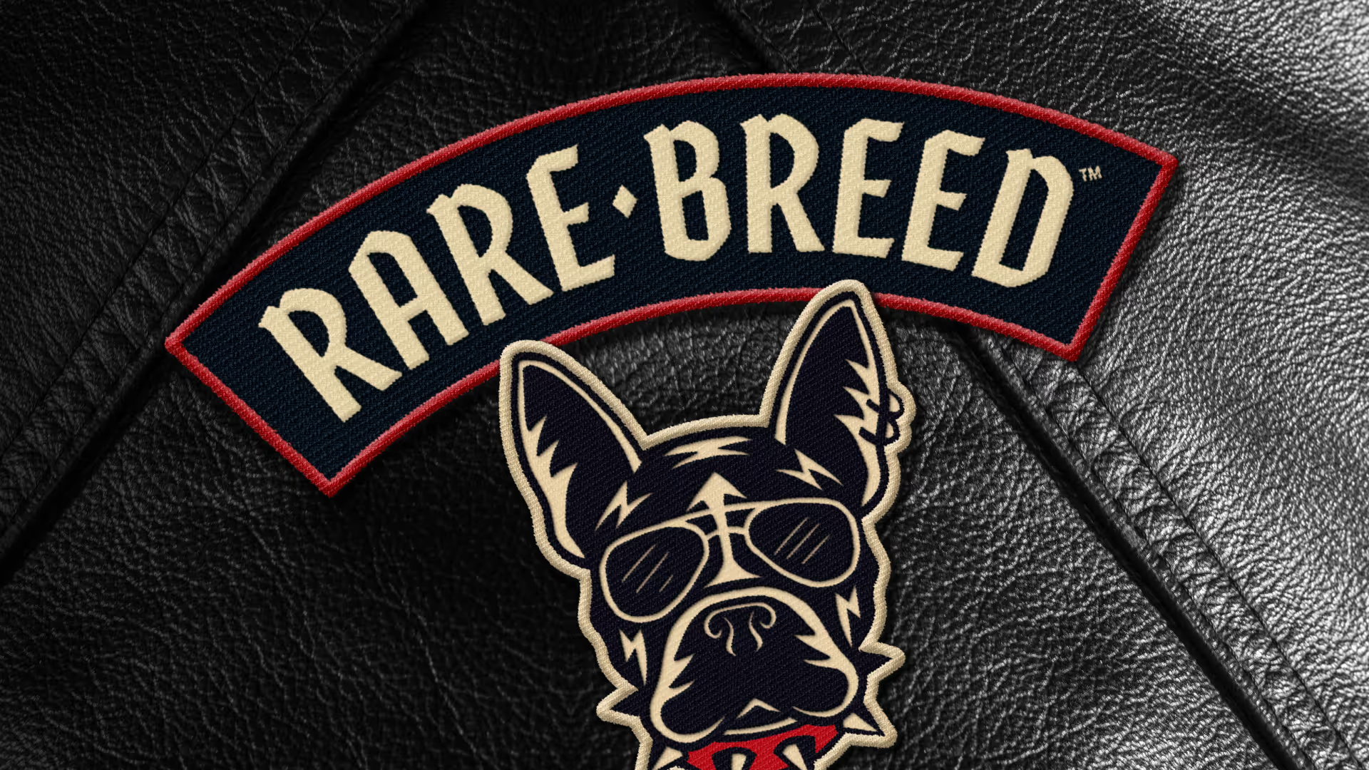
Creating a new leader of the pack
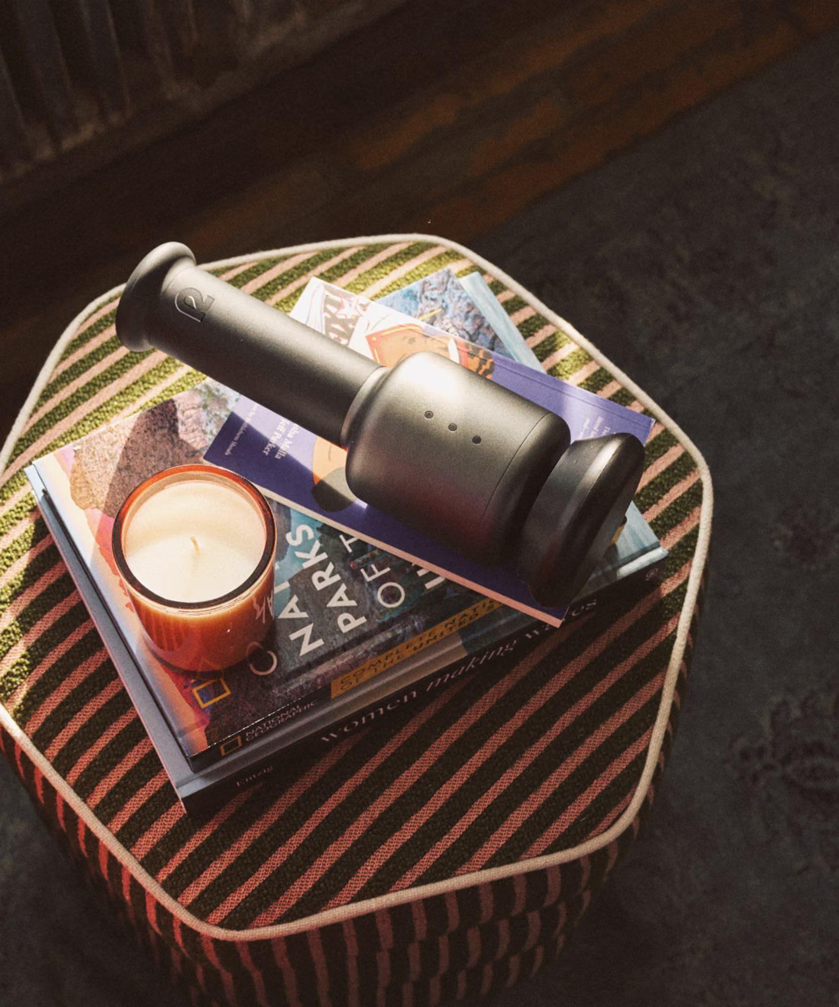
Creating a revolution in recovery
Cracking the code on healthy eating

Building on a viral sensation

Crafting the new generation of non-alc cocktails
Branding better-for-you cider

Faith meets flavor
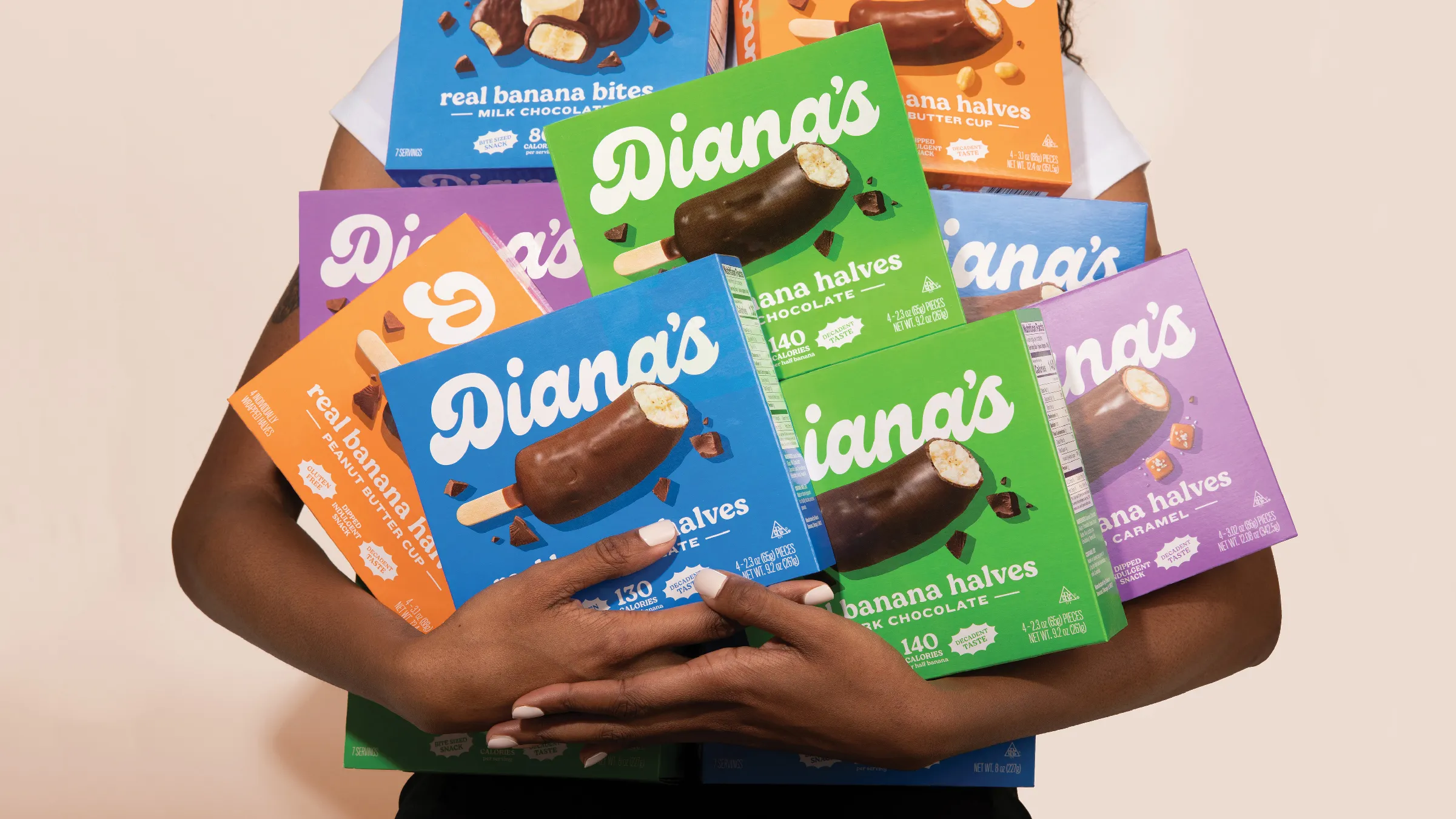
Going bananas with a classic frozen treat
