high desert
distilling the spirit of the desert
Services
Brand Strategy
Design Strategy
Visual Brand Identity & Packaging
Brand Style Guide
High Desert Vodka was already doing something extraordinary: crafting premium vodka from prickly pear cactus in the rugged highlands of San Luis Potosí. The brand approach was rooted in raw beauty, minimal interference, and deep respect for place, it stood apart on a wall of flavorless sameness. But to grow, the brand needed to do more than stand apart, it needed to stand for something.The product is bold and meaningful, but the brand wasn’t yet built to:
• Clearly communicate what it was, or why cactus mattered
• Express a point of view that matched the product’s purpose
• Scale with consistency and confidence in a competitive spirits category
The Challenge:
The question at the heart of this brand evolution was one of clarity and conviction: Was High Desert’s brand identity ready to lead with the same strength as the liquid itself?
We uncovered a tension that defined the opportunity: High Desert’s product is uncommonly distinctive: rich in story, rooted in Mexican tradition, and crafted with care. But its identity didn’t yet tell that story, nor did it carry the rugged elegance needed to grow with integrity.
Our Solution:
We gave shape to High Desert’s ethos by articulating a brand essence rooted in duality: Rugged Renaissance. A revival of self-reliance, creativity, and curiosity in a modern world. It’s a brand for those who find meaning in imperfection, who wear their weathering well, and who don’t need to speak loudly to be heard.
• Defined the brand’s essence as “Rugged Renaissance”, where frontier spirit meets creative sophistication & intellect
• Positioned High Desert as a vodka for the steadfast seeker: thoughtful, unpretentious, and enduring
• Anchored messaging in what makes the product, and the people it’s for, so different: purposeful, unpolished, and proudly off the beaten path
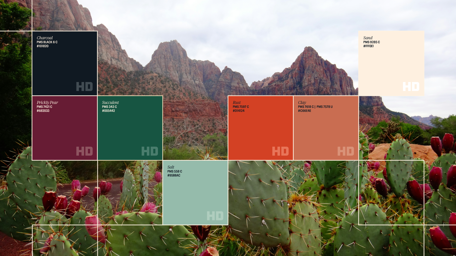
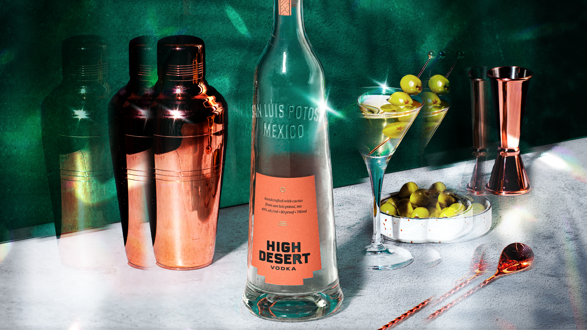
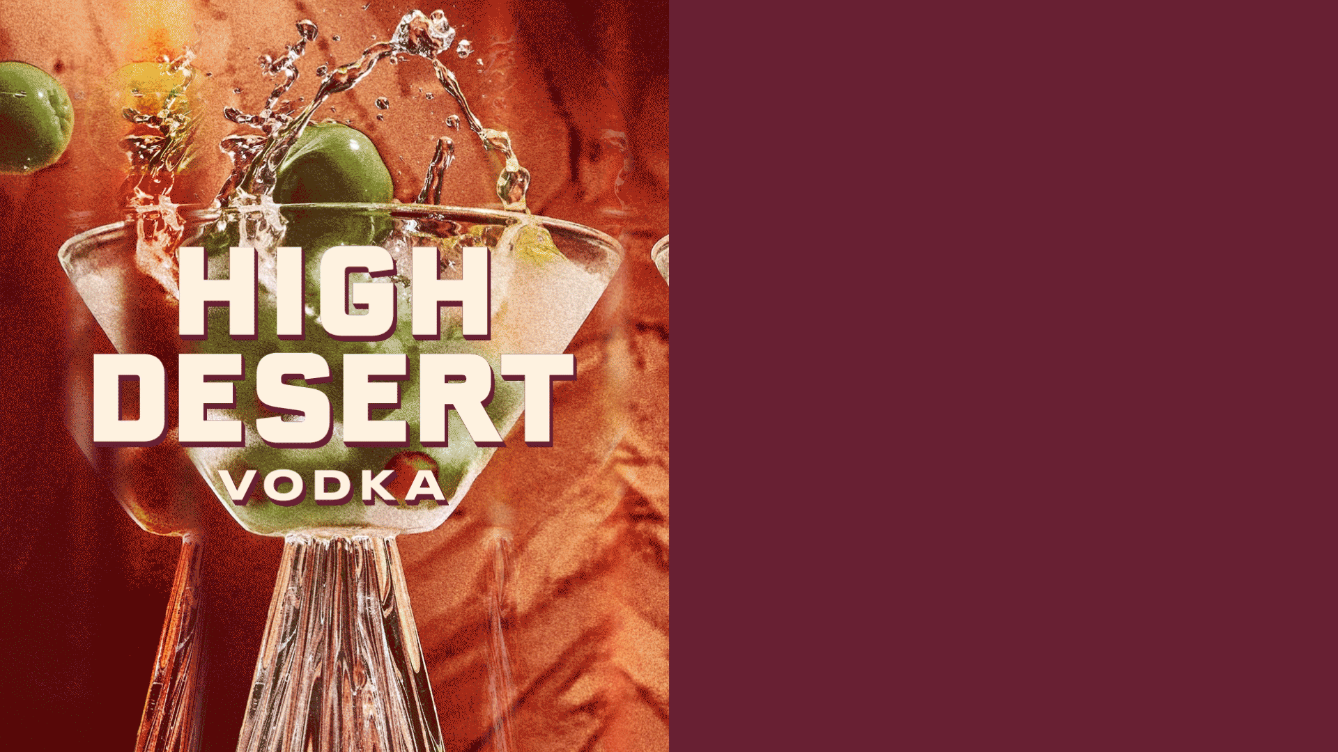
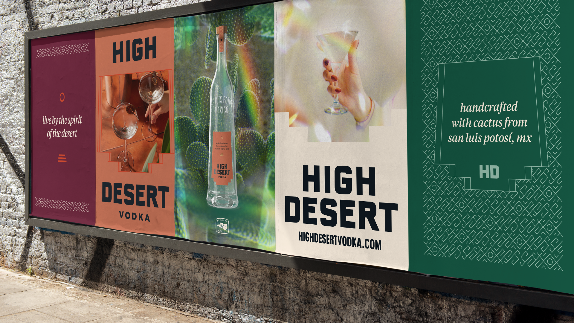
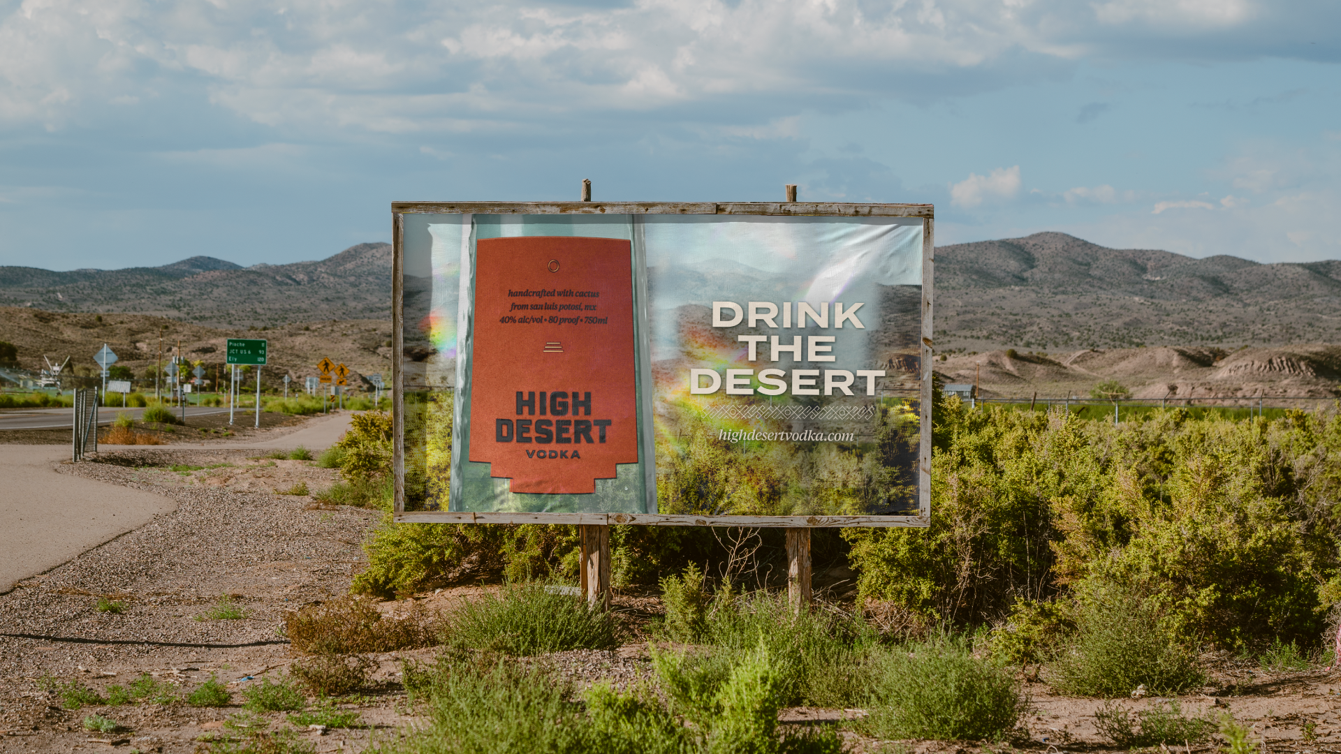
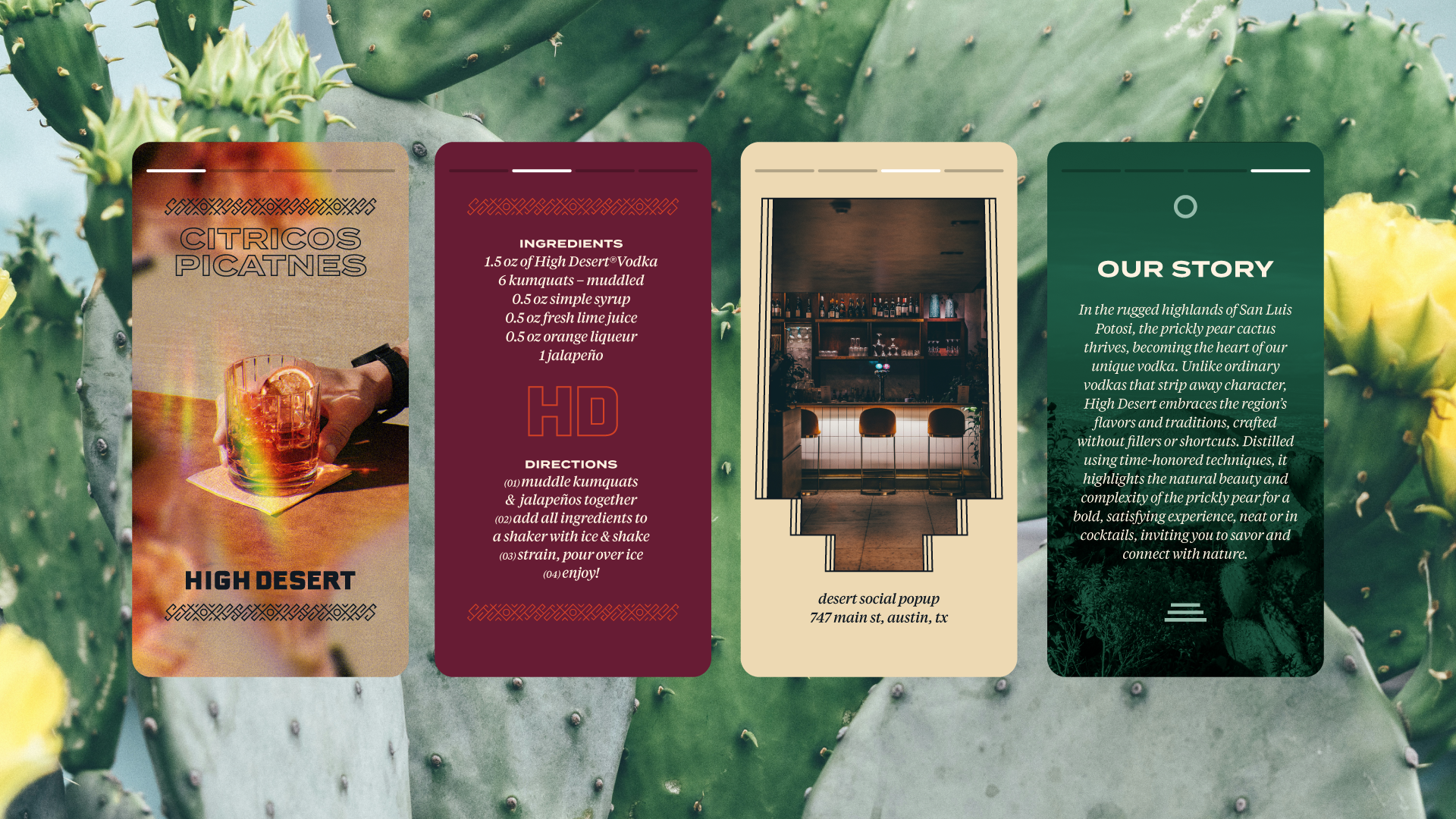
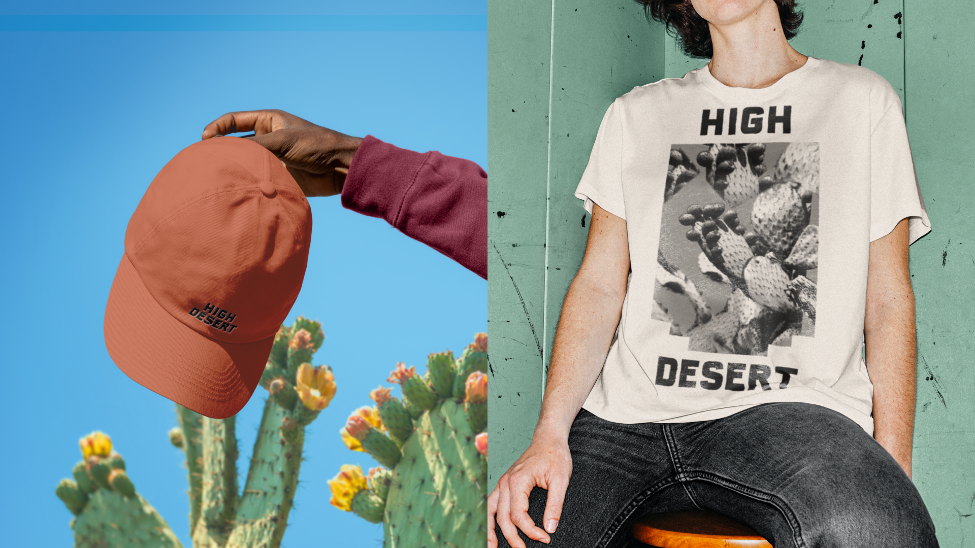
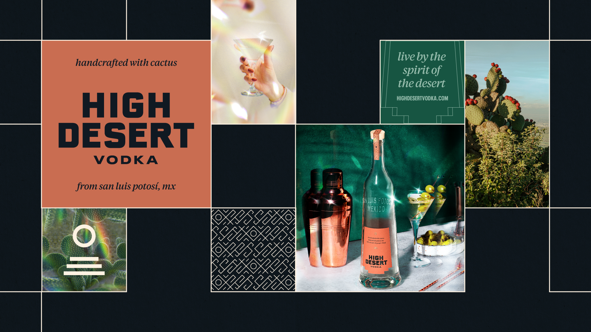
Our design celebrates a Modern Mexican Revival, blending the sharp, striking geometry of brutalist art with the soft, sunburnt serenity of the desert. This contrast mirrors our vodka’s own defiance of convention, it doesn’t feel like it belongs in the vodka aisle. It’s a rugged renaissance.Inspired by the high desert of San Luis Potosí, we leaned into minimalism, using bold, deliberate design moves to create maximum shelf impact. The bottle is clean and premium, while the brand world around it bursts with sunburnt color like a desert mirage.
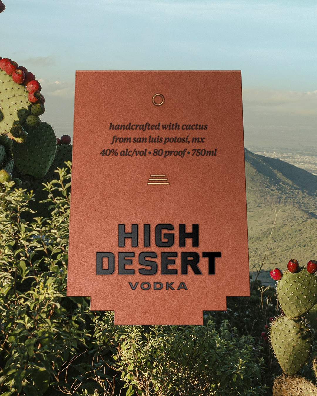
• Introduced a palette drawn from the land: sunbaked clay, sand, and stone, punctuated by wildflower brights, cactus blossoms, and gemstone succulents
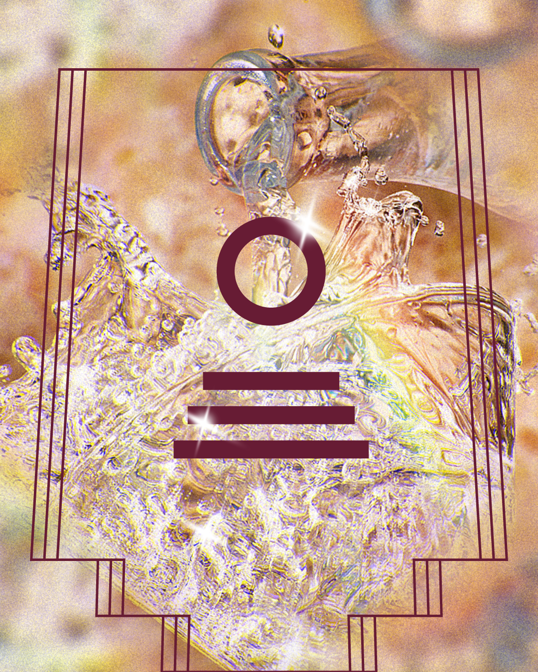
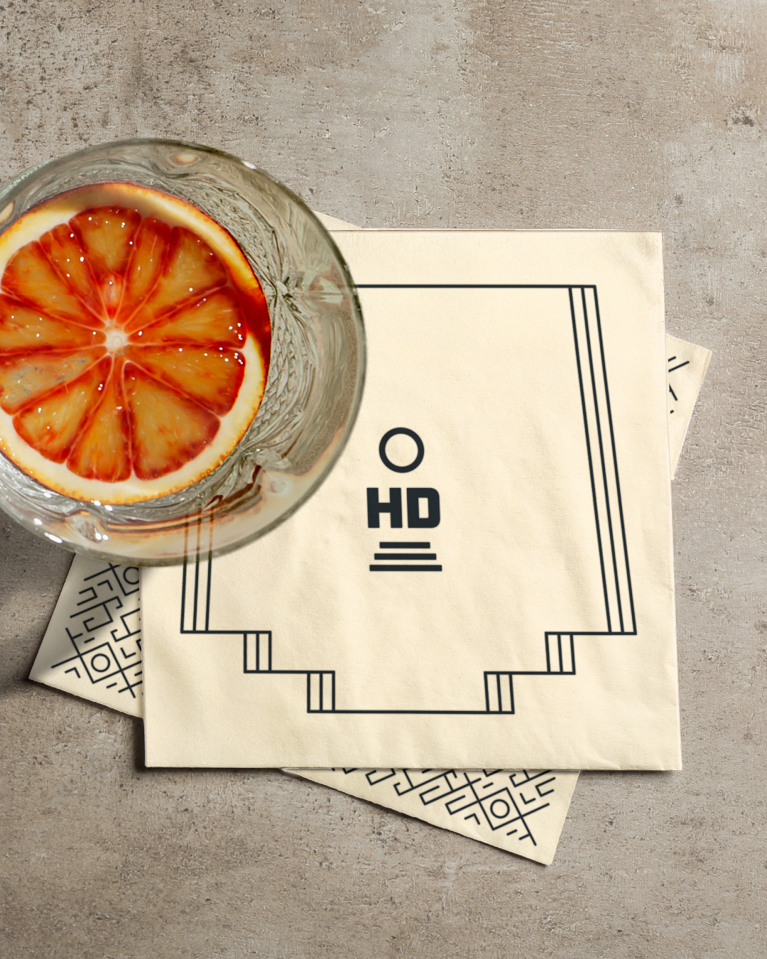
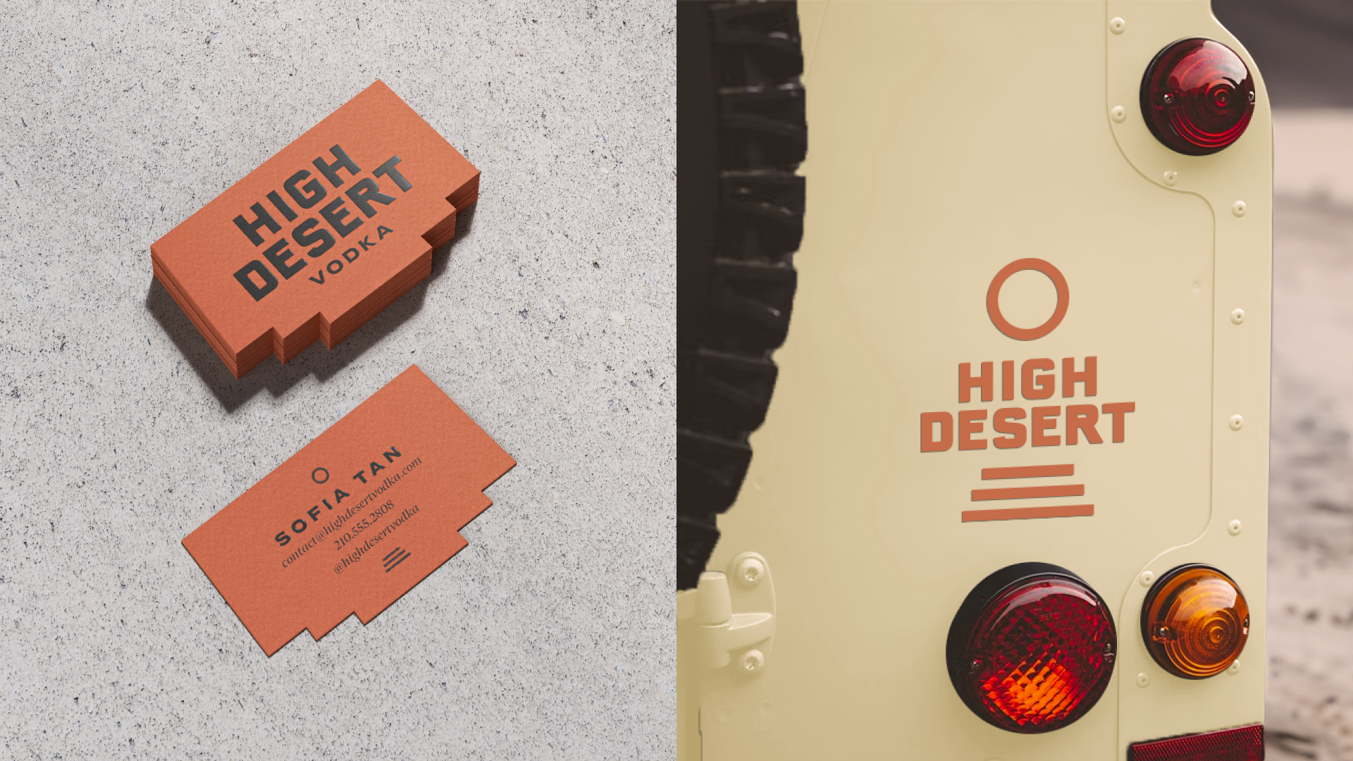
• Developed brand marks that represent the holy trinity of High Desert: the Sun, the Cactus, and the Desert Steps
• Paired brutalist typography with an elegant serif to evoke both strength and sophistication
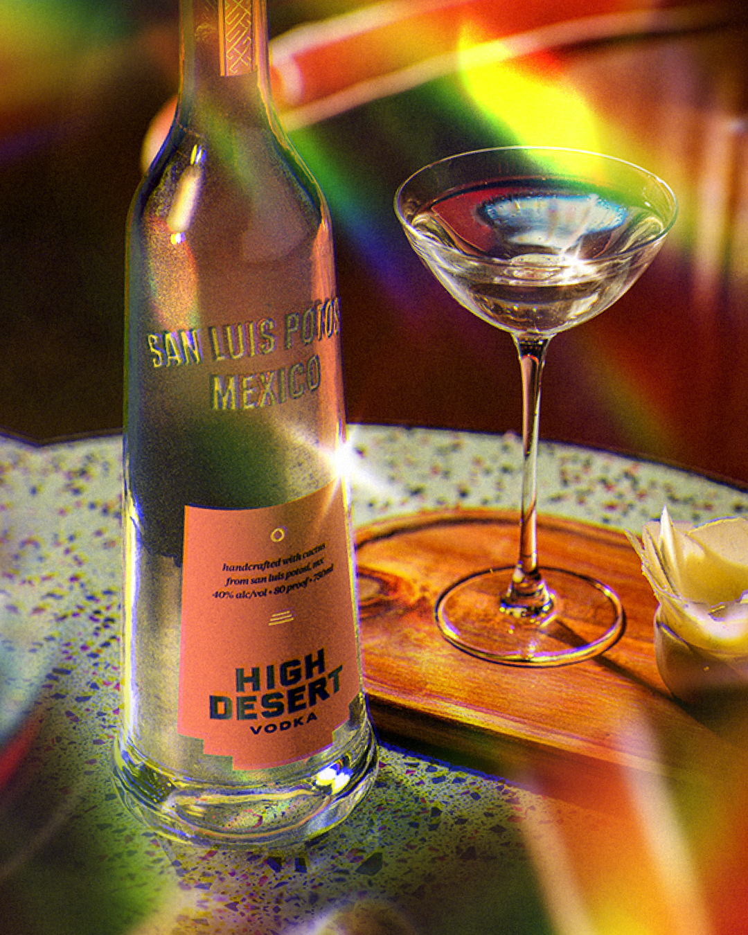
Even the bottle tells the story. With its bold, slanted silhouette and natural green tint, it carries the beautiful imperfections of handmade glass, bubbles, divots, and raw edges. Embossed into its shoulders is our birthplace: San Luis Potosí, etched with pride and permanence.
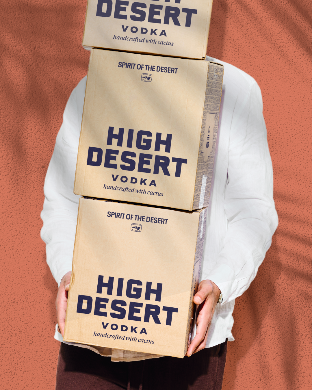
The label is printed on naturally toned terracotta paper, cut to echo the angular bottle and desert terrain of our origin. The wordmark sits stark and industrial at the base, anchored between a beating sun and a sweeping horizon. Product details float above, light, precise, and technical.While the on-pack identity leans premium and restrained, the off-pack world completes the story: surrealist photography, lush bar scenes, unexpected accent colors, and the vivid, hallucinatory beauty of life under the sun.

Other Work

going banana's with a classic frozen treat
Diana's