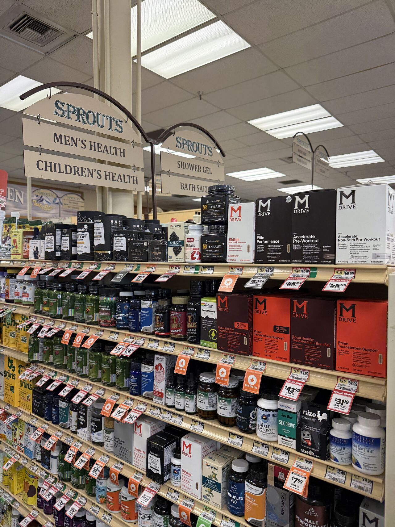
To stand out to shoppers in a chaotic retail environment - packaging has to make a visual statement, and up until now, those statements were predominantly made through appetizing visuals and colorful, bold or unexpected design – but now we’re seeing brands make statements at shelf through...well, statements.Its genius really. What’s the best way to appeal to shoppers overwhelmed with choice at shelf? To accommodate them by making it easier to make sense of the options the see - by abandoning traditional hierarchy of logo-variety-features and leading with “hey, here’s why you might want to come over here.”Here's some examples we're seeing pop up.


Coincidentally, when you lead with words that present something big, beguiling, useful or entertaining, all other packaging appears boring, subdued and conventional.Interact on Shelf is a design firm that works exclusively with grocery brands.What makes us different is that we study consumer culture, design trends, industry innovation and many other dynamics that shape opportunities for your brand in order to create iconic work that’s designed to sell in a retail environment.If you think you could benefit from partnering with a young, energetic bunch like us, you know what to do. Contact us!
Other Articles
All ArticlesOther Articles
All ArticlesFuture proof your brand.
Contact Us
