Phew, we've almost made it to the end of the week. In celebration of the weekend, we thought we'd round up some inspiration. Take a look below to see what we're into:

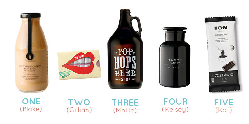
1. Pop & Bottle
"Pop & Bottle’s packaging does a great job of connecting with the brand name to drive shopper engagement by connecting the logo at the center of the bottle with the top of bottle for a memorable “pop & bottle” experience. "
-Blake

2. Trident Gum Concept
"I love the idea of taking the physical product and showcasing it in a very literal but cheeky way. This gives the consumer a sense of the product (and it's benefit) with a very ownable design that would absolutely pop off the shelf. Also, cutting out the BS and clutter shows confidence from the brand."
-Gillian

3. Top Hops Beer
"I'm such a sucker for type and even more of a sucker for designs that rely solely on typography. It seems that this sort of aesthetic is difficult to achieve with a conventional product due to call-outs, nutrition facts, and the like. But, on the bright side, that makes seeing designs like this that much more special."
-Mollie

4. March Pantry Salt
"As a big fan of apothecary-like bottles and jars, I love what March Pantry has done with their kosher salt packaging by adding a sleek black lacquer. The minimalist font and logo treatment makes the packaging all the better in my book. "
-Kelsey

5. Ion Chocolate
"I’m always drawn to designers that operate with within a more minimal framework – it’s exciting to see someone arrive at a solution with the fewest moves possible."
-Kat
Other Articles
All ArticlesNo items found.
Other Articles
All Articles
Future proof your brand.
Contact Us