
One of our favorite things about traveling is getting the opportunity to soak up packaging design from cultures outside of the US. Dig in for a rundown of some overarching trends that some of our team members have seen in their European travels.
PHOTOGRAPHY ON PACKAGE
Using photography can bring big personality to a brand. Coupled with interesting typography and layouts, these image driven labels draw lots of attention to themselves on shelf.


BOLD TYPE SOLUTIONS
Typographic choices like unconventional fonts and making objects into letters lend an edge to food packaging, and can speak volumes about the brand.


STRATEGIC WINDOWS
Product windows are being seen more and more as a sign of transparency and authenticity in food. Companies are becoming innovative in the way that they use these windows, often having them mimic the shape of the product so that it becomes seamless with the overall package design.


COLOR BLOCKING
The banality that minimalism is capable of inducing can be easily overcome by using bright, playful colors to differentiate SKU's. When lined up side by side on shelf, they create an appealing rainbow.


VIBRANT ILLUSTRATION
Illustrations can create a unique, hand-rendered feeling for products. Using contrasting colors and textures sets this type of packaging apart from some of the more structured options on shelf.


Check out the full gallery of images below!


Other Articles
All ArticlesNo items found.
Other Articles
All Articles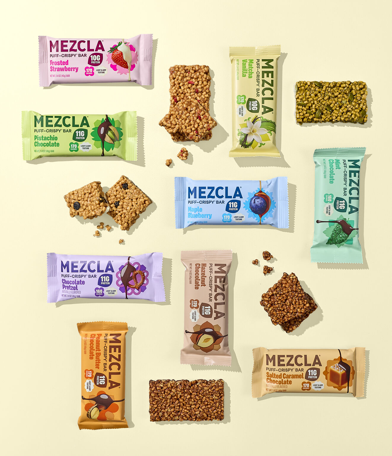
Future proof your brand.
Contact Us