
DTC Darlings: How We Elevated Category Leaders for Retail
Scaling from a beloved DTC brand to a dominant retail player isn’t just about showing up—it’s about standing out. As Dr. Squatch and Grüns got ready to launch onto shelves around the country, we helped them translate their digital-first magic into branding and packaging that wins at retail. Here’s how strategic design turned these category disruptors into household names:
Modernize, Don’t Mutate – For Dr. Squatch, we refined the brand’s mascot, keeping its rugged charm while making it sharper and more approachable. The result was a character that feels fresh but still instantly recognizable to loyal fans.
Sweat the Small Stuff – Packaging isn’t just a box; it’s a silent salesman. Every detail—color hierarchy, typography, placement—was optimized to make both Dr. Squatch & Grüns pop on shelves and convert at a glance.
Engage the Senses – Scent drives sales, so we added a die-cut window to Dr. Squatch’s packaging. Letting consumers experience the product before purchase wasn’t just a nice touch—it was a strategic play that boosted conversion.
Playfulness Meets Credibility – Grüns proves that fun and trust can coexist. We brought its gummy-shaped bear mascot to life while balancing the brand’s vibrant personality with a look that says, "Yes, this is a legit vitamin brand."
Smart Distinctions, Cohesive Portfolio – When Grüns came to us to launch their kids' line, we made sure parents could instantly spot the difference—without losing brand cohesion. Strategic color choices, intuitive naming, and iconography helped distinguish the line while keeping the brand’s playful, benefit-driven appeal front and center.
Great branding isn’t guesswork—it’s precision. Thoughtful design choices create lasting impact, and these projects were proof of that.
Want to build a brand that sticks? Let’s talk. Interact Brands
Other Articles
All ArticlesNo items found.
Other Articles
All Articles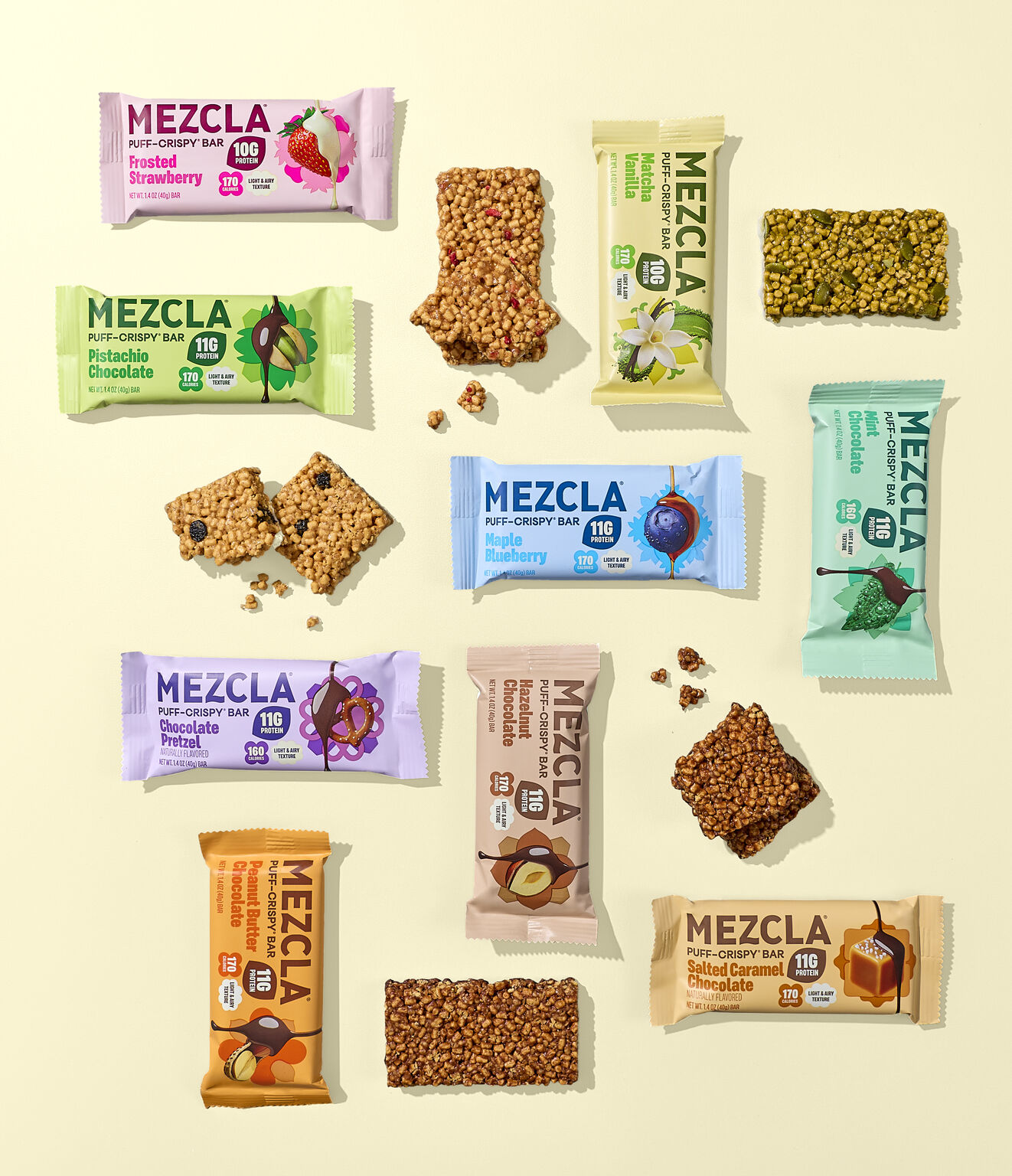
Future proof your brand.
Contact Us