
Some of the most successful food brands have enough staying power that their packaging stays recognizable over the course of time. Yet, target demographics are constantly shifting and though a brand can still be relevant, shaking things up provides an undeniable intrigue. We live for companies that push the barriers of the packaging world. So what would we redesign? Here are a few responses from the team.

If I could redesign any brand it would be Nutella. I feel like Nutella and La Croix have the same mentality of “we’ve already cornered the market, so who cares what our packaging looks like”. The illustrations are outdated and uninspiring and it’s clear this packaging design hasn’t been touched in years. Now that the Nutella wordmark has so much recognition, there is a great opportunity to either minimize it or use just parts of it – similar to what Coca Cola has done in past packaging refreshes. The brand has achieved a level of status that not many brands are lucky to attain and they now have license to reinvent themselves for the next generation of Nutella eaters.
– Kelley
Smart food white cheddar popcorn. This is a classic product from our generation – it’s one of the very first “healthy”, yet indulgent gas station snacks. It is truly a nostalgic; think road trips, sporting events, that beloved after school treat. The packaging seems unchanged, old and busy. I would love to see Smart Food to get a modern facelift to match it’s still VERY relevant place in the grocery and gas station aisles.
-Abby
I’d redesign the kid trifecta: Fruit By the Foot, Gushers, and Fruit Roll Ups. Why? Because they remain a childhood delight, but their branding still looks like it was done by a 90s graffiti artist in the middle of a bad psychedelic trip.
-Ryan
I would want to redesign the classic Kraft Macaroni and Cheese. The current design isn’t the worst thing in the world, however I think the brand and their “smile” has a lot of opportunity for some fun illustrations and a fresh way of owning orange and blue. Simplification for such a familiar brand would be an easy next step toward modernization.
-Bridget
Other Articles
All ArticlesNo items found.
Other Articles
All Articles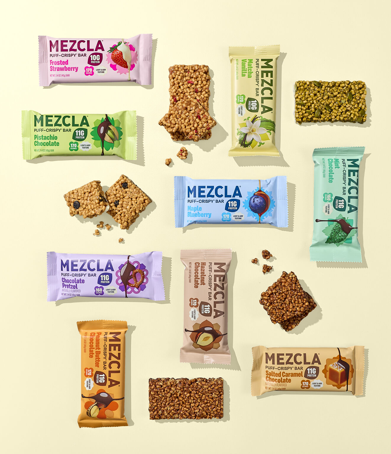
Future proof your brand.
Contact Us