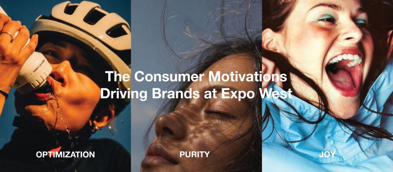
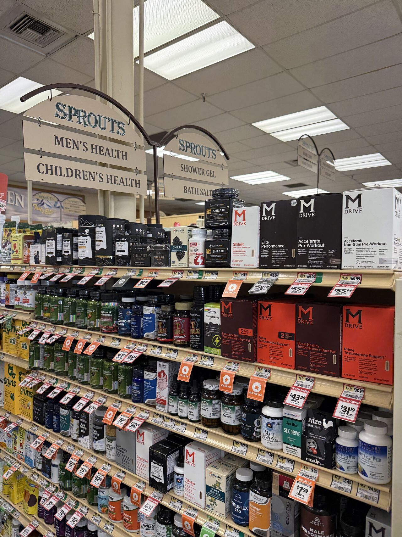
The Interact team made the annual pilgrimage to Expo West, the sacred gathering of almighty natural products. There we roamed to see the holy trinity of products - food, beverage and supplements - and worshiped many a brand and product sample.
While the team tried to stay true to their virtues, they were caught up in the sinful acts that can often transpire amongst the chaos of the trade show. As an act of self-penance, the team is confessing their 7 Deadly Sins from Expo West - have mercy on their souls!

Pride: we’re most guilty of falling in love with our own work, so this is a shameless plug of our recent work at the show:
Best Behavior’s gorgeous flavor illustrations - and YES we wanna spoon!
FeelGood Foods beautiful yellow design system.
Munk Pack’s delicious new bar photography and chipmunk icon.
TopFox’s pumpkin seed glow-up.
Milton’s new stylish pizza packaging.
Yo Egg’s oozingly beautiful brand identity.
Pizza Cupcake’s fun new brand name, Incredifulls!
Harvest Snap’s new kids line with fanciful characters created in-house.

Envy: gotta give credit where it’s due, with so much great design at the show, we had our moments where we wished we’d designed a few of the brands:
Vuum Energy’s slick and bare-bones aluminum can design.
Beekeeper Coffee’s simple and iconic logo and packaging.
Tim Tam Tummy’s naming conventions and mantras for its kid-focused kombucha #mangoforit.

Gluttony: while we tried a lot of different products at the show, these are the brands we gorged ourselves on the most
Laonan’s Pork Soup Dumplings had us literally begging for more.
We turned Deep Indian Kitchen’s new Chicken Tikka Masala & Butter Chicken Kati Street Wrap samples into an all-you-can-eat buffet.

Lust: these are the brands from the show that we wanted to get into bed with, be it for their beautiful branding or scintillating messaging
Death Wish Coffee’s Tagline “Rage Against Your Routine” made our inner copywriter yearn for more dirty (espresso) talk.
Coyotas Tortillas' beautiful type-driven packaging made us wish we could be the filling.
Harken’s beautiful script wordmark had us wishing it’d send us Valentines and a pool of chocolate to bathe in.

Sloth: brands with real potential that sadly haven’t put in the time and effort to their branding that they deserve:
Unicorn Tots have an incredibly delicious product but sadly their solemn brown packaging doesn’t live up to the name.
Green Girl Bakeshop has mind-blowing plant-based ice creams but their branding makes them feel a little stale and traditional.
Singing Dog Vanilla it’s organic, it’s mission-based and the founders are dog lovers, they could really be a challenger in the “vanillaverse” if they could learn a couple of new branding tricks.

Wrath: these are the mistakes brands often make that set them back and us into a branding rage:
Layonna’s Asian-inspired plant-based meat lacked easy-to-shop design cues as all the bags were slightly different shades of one another.
Earth Life Foods came out with amazing plant-based corn dogs but their communication hierarchy was so off it made the product feel like a commodity.
Pacha Bread had an awesome product that’s surprisingly gluten free but they have a logo that is hard to read and thus remember.

Greed: amazing products can often get lost when a brand takes credit for everything that makes them special:
Alexandre Family Farm is a pioneer of organic and regenerative practices but list too many product claims, creating clutter.
Todd’s Eggcellent Protein Puffs has 13 different lines of copy on the front of their packaging alone.
Funky Fresh’s delicious spring rolls had 11 unsavory pieces of communication all over their packaging.
This was our experience and want to hear yours.
To continue the conversation reach out to us hungry@interactbrands.com.
Other Articles
All ArticlesOther Articles
All ArticlesFuture proof your brand.
Contact Us
